Crown prince seafood2025 PACKAGING DESIGN

-
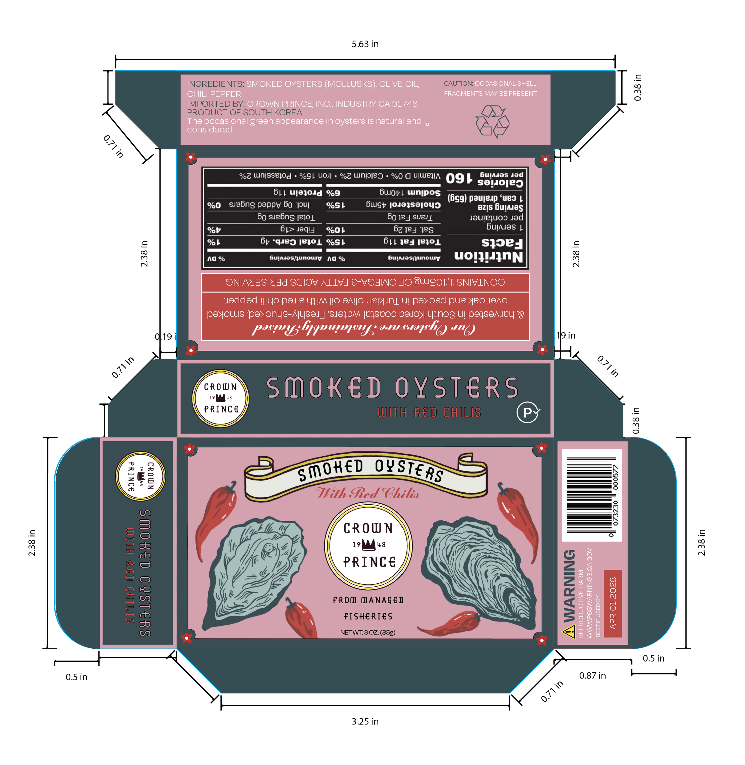
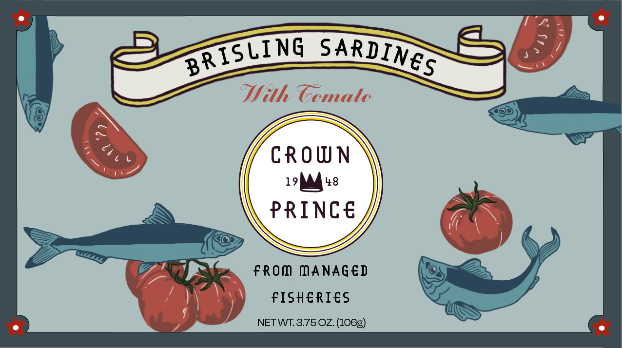
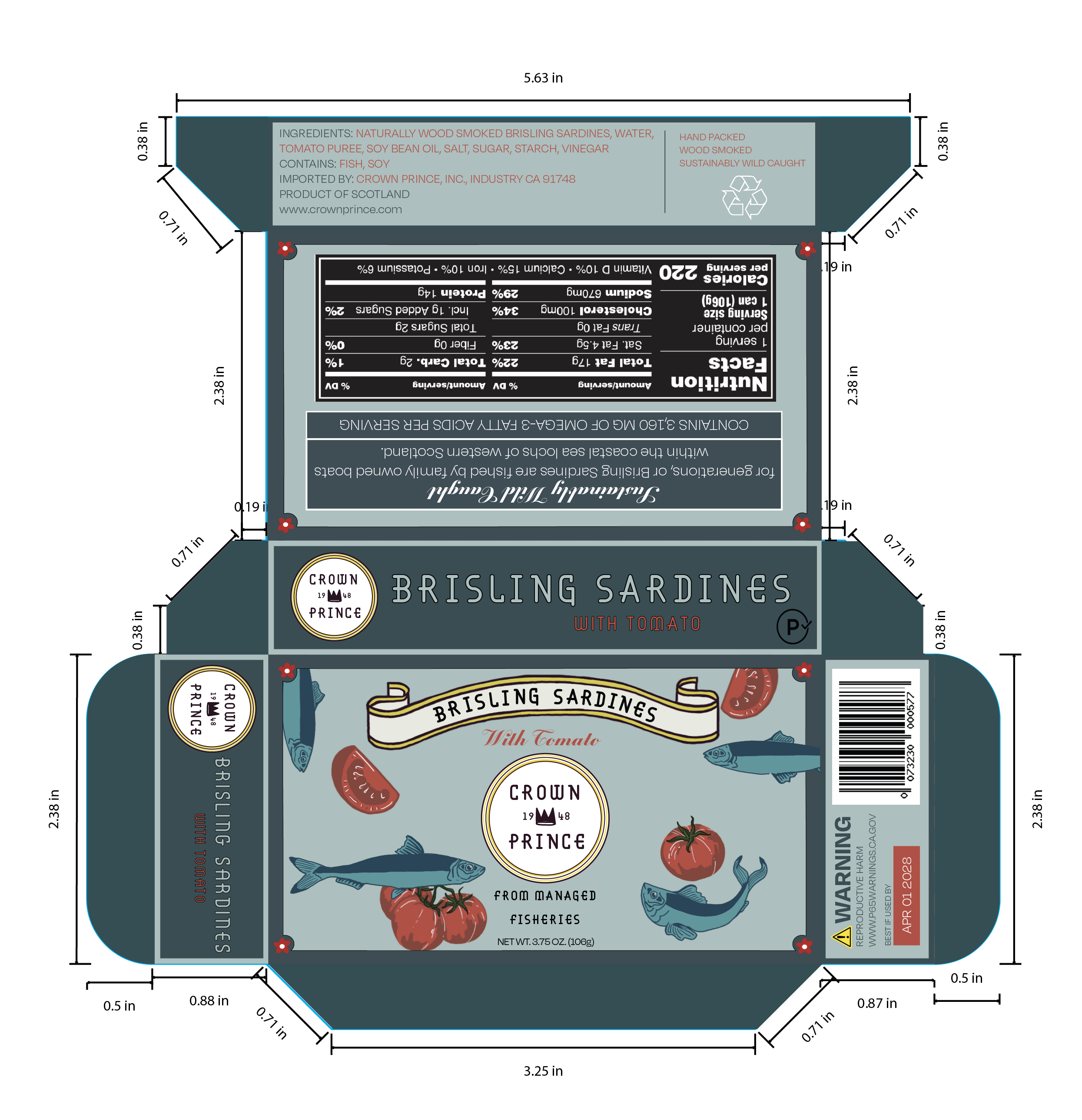
This packaging redesign for Crown Prince Seafood seeks to revitalize the brand’s shelf presence, while complimenting its long history of providing high quality seafood. Their design felt outdated and often blended into the sea of tinned fish, without capturing the artisanal and sustainable qualities of Crown Prince. I aimed to modernize their design yet embrace their heritage. With color palette, illustrations, and typography I aimed to capture the perfect combination of modern and vintage design. The new packaging design encourages shoppers to view Crown Prince as a sustainable pantry staple, not a last-resort food.
With hand-drawn illustrations and ribbon banner we bring a sense of craftsmanship and nostalgia to their design which will help it to stand out on the shelf. A palette of muted blues, deep reds, and dark teals gives a sense of fresh out of the water quality, and a yellow logo and banner to add more warmth to the muted palette. A bold decorative typeface paired with a romantic script furthers the vintage-modern balance.